For an article I’m writing, I wanted to do a simple diagram that would illustrate the swaps needed to sort a one dimensional array using various sort algorithms. My idea is to visually show the complexity difference between an insertion sort, and a bin sort. Specifically the O(n^2) vs. O(n + K) complexity.
Now, I have Adobe Photoshop and Illustrator, so should be able to do something reasonable using those tools. I boot up Illustrator, and I do a first attempt in about ten minutes.
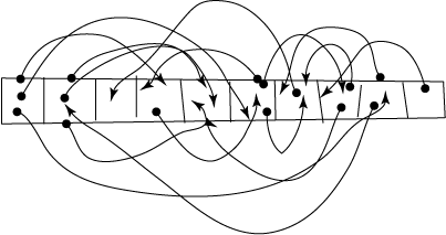
Not terrible, but not really clear what is going on, and the lines are all kind of wobbly. The array is crappy looking as well. This is just something I did using the pencil tool, basically drawing the lines in freehand and adding arrowheads.
My feeling here is that I want to be able to generate the diagram algorithmically, the same way I did for the “Random Scattering” article – draw it on screen, and generate XML that can be loaded into illustrator for final (post) editing. But I also worry I’m missing something obvious, so I resolve to spend at least half an hour or so looking for ways to make something nice in Illustrator.
First – How do I get a nice row of boxes? Let’s start with one box: Use the box tool to draw one, and edit the W and H manually to 30 pts. Hmm, then I discover the grid tool, and I immediately think that my copy of Illustrator CS2 is chock full of bugs and I can’t figure out how to draw anything in it without everything exploding, but eventually figure out all was working fine, I was just drawing with an invisible brush. ha! So I figure some stuff out an after 15 minutes or so come up with:
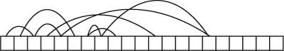
Pretty nice and clean, with good clear curves, but missing rather a lot of lines. Yup, I got bored after drawing a few lines. You see for an insertion sort to work, there will be N*N compares and approx N*ln(N) swaps, which would be 20*3 =60 lines if I just draw the swaps, and drawing in all N*N (400) compares would be a bit redundant. [Actually it’s not N*N, it’s N*(N-1)/2, so only 190, but still]
But what I really want is to generate the diagram automatically. I’d also want nice arrow heads. One thing that really bugs me about Illustrator is whenever I’ve tried to do arrow heads, it just put them so the MIDDLE of the arrowhead is at the end of the line, when what I want is for the tip of the arrow head to be at the end of the line. So if I just add Filter/(Illustrator Filters) Add Arrowheads/ Arrowhead 3, it comes out like this:
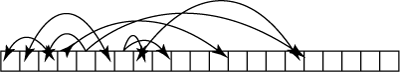
I want the arrowhead to point to something, not past it!!!! And what’s not helping is my Illustrator “help” is broken. Hmm, I wonder if I forgot to download it or something. Anyway – you can see why they do this – paths (the line) are arbitrarily wide, and arrowhead taper to a point, so if the arrowhead ended where the path did, then the point of the arrow would become blunt. But then how do I get an arrow where the point ends up at a particular place. It seems like illustrator is useless for this – even just as a basis for automating a diagram, and I should perhaps re-visit some other boxes+arrows software. Like: Smartdraw, which I actually own a copy of (Version 7, and it’s now at version 11). I’ll try the free demo. I should also try Openoffice and InkScape.
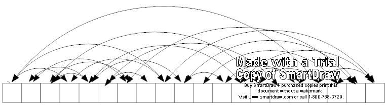
well, that’s the quick and dirty SmartDraw version.
I’m thinking that SVG is the way to go. That’s what I used in the Scatter article. Inkscape is native SVG, so might work out. AI can also import SVG (but SmartDraw, apparently, cannot)
Hmm, Inkscape seems quite reasonably compact in its boxes and arrows. But AI seems to have a problem exporting the SVG created by inkscape – specifically paths with control points seem to just vanish. However, since the export to PDF still works fine, I’m thinking it should be okay.
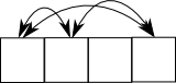
Here’s a quick test exported from InkScape, which should be fairly easy to generate.
And, Bingo, a few hours later I get the bare bones of the SVG exporting library working, and generate this:
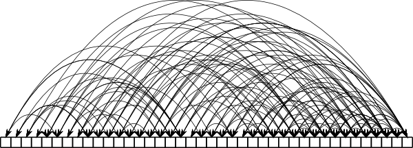
That’s just 40 boxes, each one is randomly linked to four boxes ahead of it. I should really make it so it actually sorts some random numbers, and shows all the swaps needed. Use differing colors for the Nth swap.
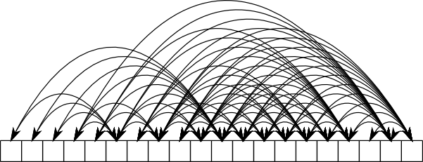
Here’s the basic swapping:
A bit odd – there seems no good reason why some entries would had more swaps than others. Interesting, when you look at the big picture – see how the initial passes, EVEN THOUGH THEY COMPARE MORE SLOTS, have far fewer swaps than the later passes that have half as many comparisons.
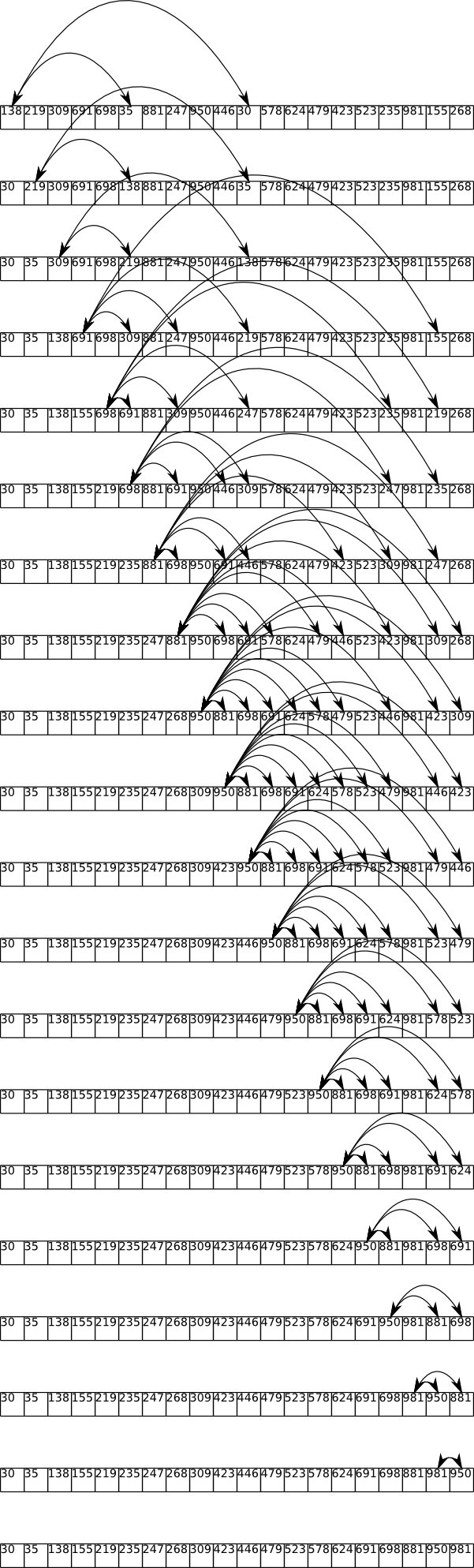
Very interesting. This method of swapping whenever we find a pair out of order is having the effect of pumping the low numbers into the second half of the array. Normally I would keep the index of the highest found so far, and only swap the highest one found. That would obviously be better than this method as it would avoid the pumping, and only have one swap per pass. But it’s still quite bad in that it requires N*(N-1)/2 compares.
So I’m sidetracking here, wondering if we could actually use the “always swap” method, but modify it slightly, so instead of swapping our top value I with J, we instead rotate I >> I+1 >> J (hence J >> I). Hmm, the problem swap is never the first one. The key here is to use some of the information we have. We know than in the second swap, we want the value that is currently top remain. Obviously this is just going to approach quicksort, but there might be some interesting optimization’s tailored for specific sized sets of data.
hi,
you should have a look at the arc diagram visualization by martin wattenberg:
http://www.research.ibm.com/visual/papers/arc-diagrams.pdf
it is somewhat related with you sorting visualizations. Link directions could be visualized by placing the arc either above or below the box line.
Comment by Janne — April 6, 2008 @ 9:48 pm
Hi Janne,
that does look similar – but it’s representing a different kind of thing. The arc diagrams show static relationships on a fixed string, whereas here I’m showing the dynamic actions of sorting a string.
Comment by Mick West — April 9, 2008 @ 1:18 pm